The Foundation of Beautiful Interior Design
Creating stunning colour and material harmony isn't reserved for professional interior designers. With the right knowledge, any homeowner can transform their living space into a perfectly balanced sanctuary. The secret lies in understanding how colours and materials work together to influence both the visual appeal and emotional atmosphere of your home.
When you walk into a room that feels instantly welcoming, it's rarely by accident. The magic happens when colours complement each other naturally and materials create a cohesive story throughout the space. This harmony affects more than just aesthetics—it directly impacts how comfortable and at peace you feel in your own home.
Understanding the Science of Colour Harmony
Professional designers rely on time-tested colour theory principles that anyone can master:
- Monochromatic schemes: Using varying shades and tones of a single colour family
- Analogous combinations: Selecting colours that sit adjacent on the colour wheel
- Complementary pairings: Choosing colours directly opposite each other on the wheel
- Triadic arrangements: Three evenly spaced colours forming a triangle on the wheel
The renowned 60-30-10 rule provides an excellent starting framework: allocate 60% to your dominant colour, 30% to a supporting tone, and 10% to accent colours. This ratio naturally creates visual balance whilst allowing for personality and flair.
Mastering Material Combinations
Selecting materials involves more than visual appeal—texture, functionality, and tactile experience all play crucial roles. Each material brings distinct characteristics to your space:
Timber introduces warmth and natural beauty, particularly popular in British homes from Victorian terraces to modern new builds. Metal elements provide contemporary edge and industrial appeal. Stone surfaces offer permanence and grounding. Glass creates lightness and spatial flow. Textiles add comfort and acoustic softness.
Creating Dynamic Contrast
Successful material harmony thrives on thoughtful contrast rather than uniformity:
- Rough textures alongside smooth surfaces
- Matt finishes paired with glossy elements
- Warm materials balanced with cooler options
Avoid overwhelming your space by limiting yourself to three or four primary materials per room. This restraint creates sophistication rather than visual chaos.
The Impact of British Light on Colour Choices
Britain's unique light conditions significantly affect colour perception throughout the day and seasons. Northern exposure provides cooler, more consistent light, whilst southern aspects offer warmer illumination. Our frequently overcast skies can flatten certain colours, making others appear more vibrant.
Always test colour samples under various lighting conditions—from bright morning sun to cosy evening lamplight. That gorgeous sage green in the shop might appear quite different in your Georgian flat or modern extension.
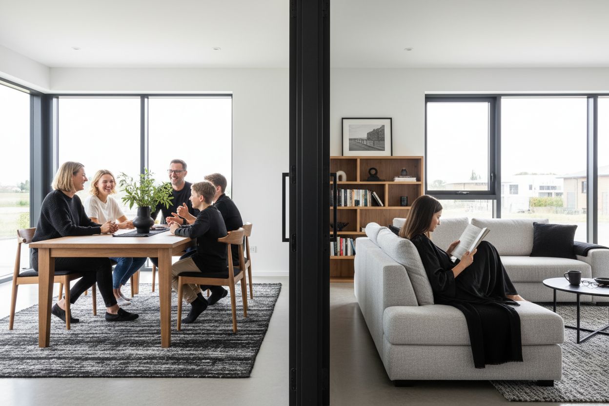
Creating Flow Between Spaces
Contemporary British homes, from converted warehouses to open-plan extensions, benefit enormously from cohesive colour journeys between areas. Rather than treating each room as an isolated space, develop a flowing narrative that connects your entire home whilst allowing individual rooms their unique character.
This approach proves particularly valuable in the popular open-plan living arrangements found in many British properties, where kitchen, dining, and living areas merge into one continuous space.
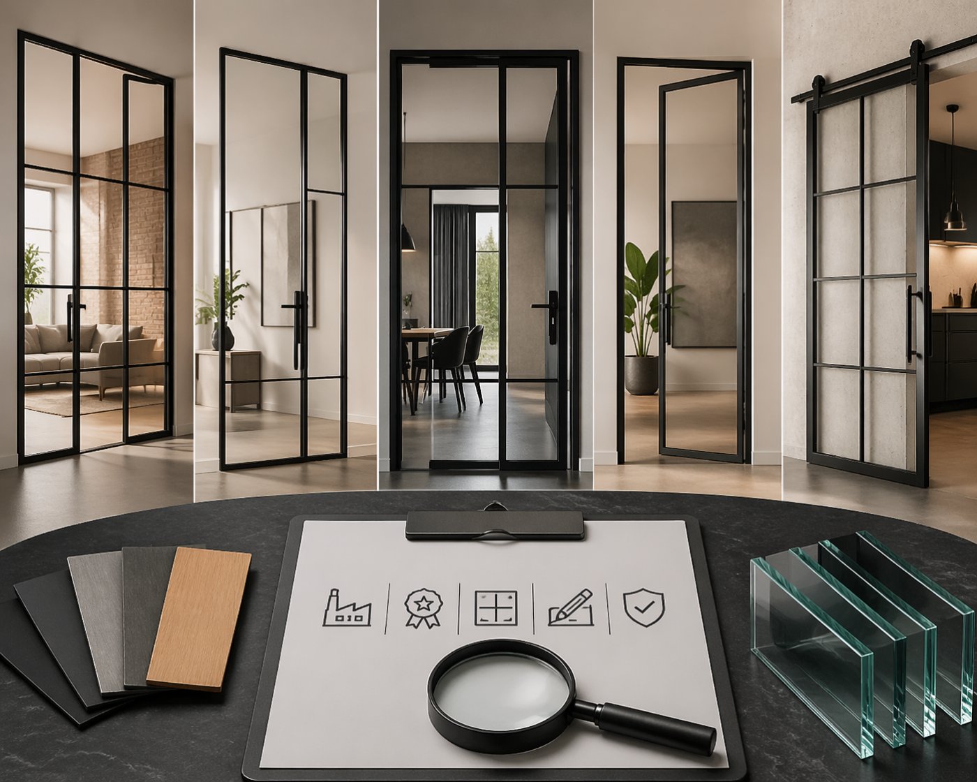
Room Dividers as Design Features
When open-plan living requires defined zones, stylish room dividers offer the perfect solution. These elements maintain visual connection whilst providing functional separation—ideal for creating a home office within a living area or defining dining space in an open kitchen.
Glass elements in room dividers allow light to flow freely, preserving the sense of space whilst enabling you to control colour interactions between areas. When selecting dividers, ensure they complement your overall colour scheme and material palette.
Timeless Colour Combinations for British Homes
Certain colour pairings have proven their enduring appeal in British interiors:
- Navy and cream: Classic sophistication perfect for period properties
- Sage green and oak: Natural harmony ideal for country cottages and modern eco-homes
- Charcoal and soft pink: Contemporary elegance with warmth
- Warm white and brass accents: Timeless luxury suitable for any architectural style
These combinations provide excellent foundations that you can personalise with artwork, plants, and accessories.
Custom Elements for Perfect Integration
Sometimes achieving perfect harmony requires bespoke solutions tailored precisely to your space. Custom-made furniture allows you to match exact colour requirements and proportions that standard pieces simply cannot provide.
At Manufaktur X, our 3D configurator enables you to visualise exactly how custom pieces will integrate with your existing décor. Whether you need a dining table in specific dimensions or loft doors with precise frame colours, bespoke manufacturing ensures perfect harmony with your design vision.
Colour Psychology in British Interiors
Understanding how colours affect mood becomes particularly relevant during Britain's long winter months when we spend considerable time indoors:
Blue tones: Promote calmness and concentration—excellent for home offices or bedrooms in busy households. Yellow and orange: Inject energy and optimism—perfect for kitchens and breakfast rooms during grey mornings. Green shades: Connect us with nature and promote relaxation—ideal for living rooms and bathrooms.
Consider your room's primary function when selecting colours, balancing personal preference with psychological impact.
Adapting Harmony to British Design Styles
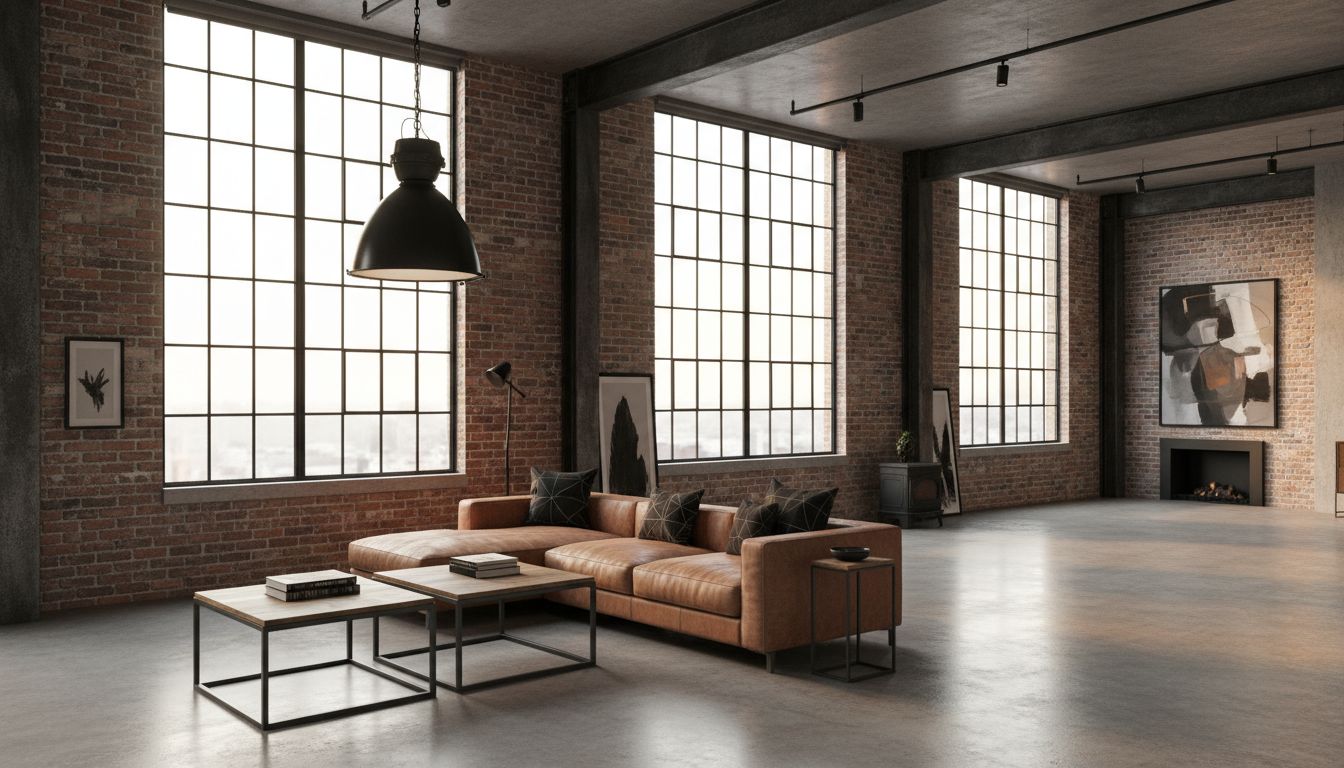
Contemporary Industrial
Popular in converted warehouses and loft apartments, this style embraces exposed brick, steel beams, and concrete. Dark metal frames and glass panels create striking focal points whilst maintaining the raw, urban aesthetic.
Traditional Country
Classic British country style relies on warm, muted tones inspired by the countryside. Cream, soft greens, and heritage blues combined with natural oak and stone create timeless elegance.
Modern Scandinavian
Light woods, whites, and minimal colour palettes maximise natural light—particularly valuable in British homes. This style works beautifully in Victorian conversions and modern new builds alike.
Seasonal Flexibility
British seasons dramatically affect our indoor environment and mood. Build flexibility into your colour scheme through changeable elements:
Spring and summer call for lighter, fresher tones that reflect increased daylight and outdoor time. Autumn and winter benefit from warmer, richer colours that create cosy refuges from harsh weather.
Use throws, cushions, artwork, and lighting to adapt your space seasonally without major redecoration.
Small Space Harmony
Many British homes, particularly in cities, feature compact rooms where colour and material choices become even more critical:
- Light, cool colours expand visual space
- Unified colour schemes create calm and spaciousness
- Reflective surfaces bounce light around
- Glass elements maintain sight lines
Custom solutions prove invaluable in small spaces, allowing you to maximise every centimetre whilst maintaining design harmony.
Sustainable Material Choices
British homeowners increasingly prioritise environmental responsibility alongside aesthetic appeal. Natural materials like sustainably sourced timber, recycled metal, and reclaimed stone offer both ecological benefits and unique character that improves with age.
Quality, durable materials require less frequent replacement, making them both environmentally and economically sensible choices for long-term home harmony.
Acoustic Considerations
Material choices significantly impact room acoustics—particularly important in British terraced houses and flats where sound transmission affects neighbours. Hard surfaces like tiles and metal reflect sound, whilst soft furnishings, timber, and textiles absorb it.
Balance sound-reflecting and sound-absorbing materials to create both visual and acoustic harmony throughout your home.
Professional Results, Personal Style
Creating beautiful colour and material harmony combines technical knowledge with personal intuition. Trust your instincts whilst applying these professional principles. Your home should reflect your personality whilst demonstrating sophisticated design understanding.
Remember that perfect harmony develops over time. Start with a strong foundation and gradually refine your choices as you live in and understand your space better. The goal isn't magazine perfection—it's creating a home where you feel completely comfortable and inspired every day.